Icon
The Icon component allows you to add any of the 3,000+ supported icons as standalone application components. Users can customize the size and color of an icon, as well as trigger events when it is clicked.
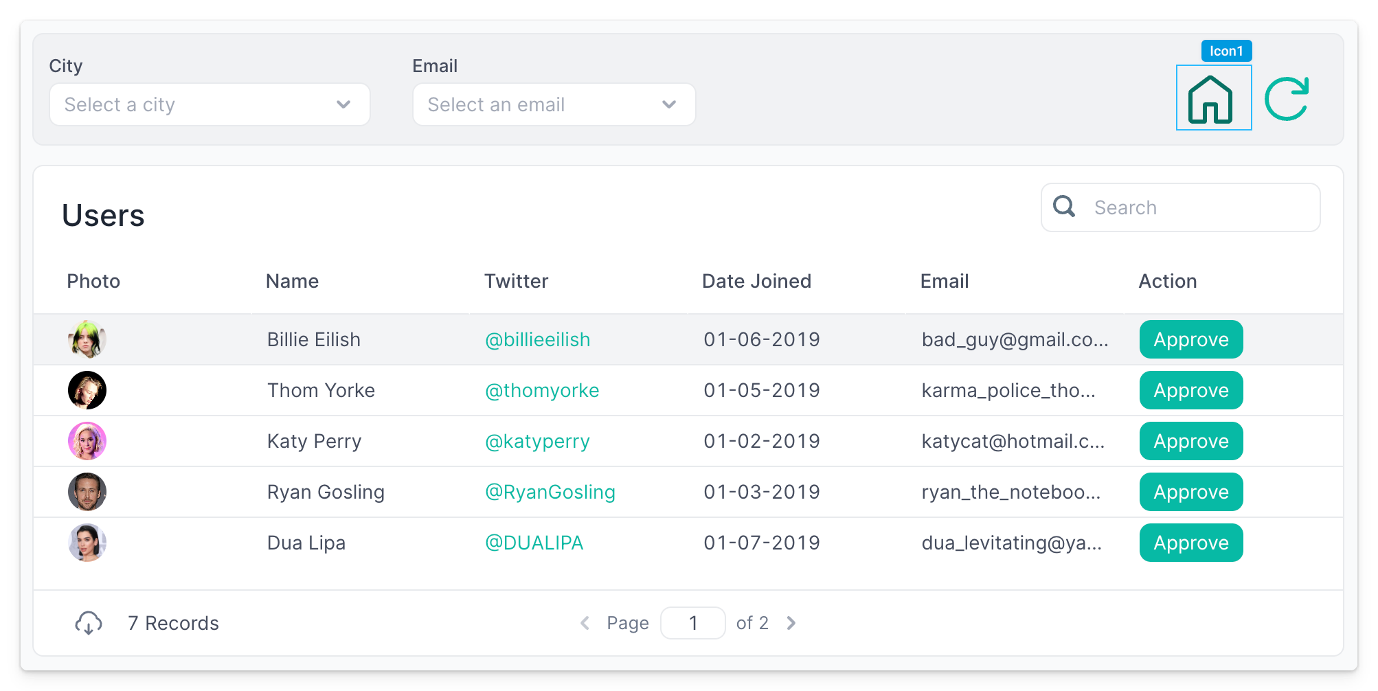
Icon Properties
Component Properties
| Property | Description |
|---|---|
| Icon | The icon to display |
| Color | Color of the icon |
| Loading Animation | Controls whether the icon should display a loading animation when a dependent API is running |
| Visible | Controls the visibility of the component, values are a boolean |
Reference Properties
Properties can be accessed from other frontend components and backend APIs by adding the name of the Icon component, and dot referencing the property. For an Icon named Icon1:
| Property | Description |
|---|---|
Icon1.icon | Returns the icon's name as a string |
Icon1.isVisible | Returns the boolean value of the icon's visibility (True, if it is visible) |
Events
The following events are triggered by user interactions with Icon components. Use event handlers to trigger actions in response to user events.
| Property | Description |
|---|---|
| onClick | Event that fires when the icon is clicked |